Design System
Creating a durable system that support growth, adaptability, and lean development.
The Company
Akinox develops digital healthcare solutions designed to improve overall patient care, covering a wide range of needs such as tele-health, referrals, appointments, patient/provider communication, etc.
The Context
Akinox went from ten to over a hundred employees in less than a year, mostly due to the COVID-19 pandemic. With that rapid growth, and the need to deliver faster than mockups could be provided, came a few design challenges, one of them being the absence of a design system.
The Problems
There was no official tool for designers : one was working in Axure, others in Sketch and Figma. Designers working in silos with components that were neither shared or reused, which led to severe user experience inconsistency across platforms.
The developers worked with both a half-baked custom library and a pre-built one, so the code was a mismatched mess of items that were overwritten more often than not.
Akinox being a holocracy, no one was really in charge of setting a direction and address those issues.
The Objective
To streamline the design and development process, improve collaboration between teams, and enhance the overall quality of the user experience by providing guidelines, principles, and reusable components to designers and developers.
My Role
I led the project by taking charge of organizing meetings and workshops and coordinating our design effort with the frontend team. I also conducted most of the initial design audit, and largely participated in the construction of the Figma library components.
Scope & Purpose
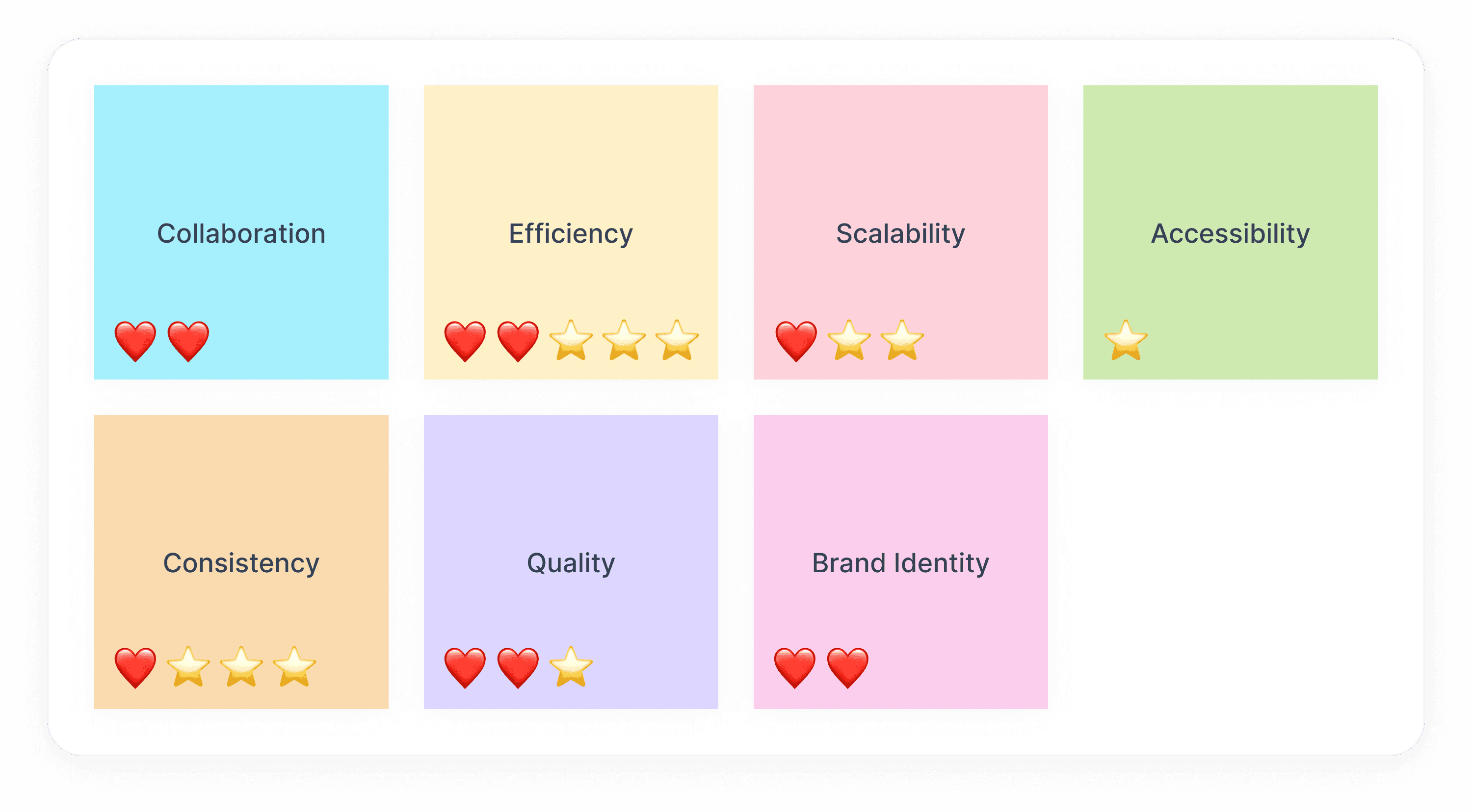
I started with a workshop to define the scope of our design system. I felt it was important for designers and developers alike to determine the main goal of this initiative. We first brainstormed on a list of possible goals, and then everyone voted on the two they found most relevant - hearts for developers, stars for designers.
In the end, we all agreed that while a lack of consistency was certainly pretty damageable for our users, poor efficiency had the most impact on the work of our teams.
A word on Accessibility
I was familiar with basic accessibility principles, but working at Akinox made me realize how little I knew. Since we were designing for a governmental instance, we had very strict guidelines to follow, especially in terms of patterns, keyboard controls and input feeback.
Design Audit & Choice of Tool
It's no secret how fast the trends evolve in terms of design tools, but this was 2022 and we all agreed that Figma was the tool of the (near?) future, and its collaborative features made this decision a no-brainer.
I then proceeded to list all standard components and patterns in a Ui kit, and we upvoted the ones that were the most widely spread - for instance, our apps contain lots of forms, so input fields would naturally come up on top of our priority list.
Untitled Ui
It didn't make sense for us, in this context, to start from scratch on a completely blank page. We barely had time for this project, and we already had a huge Ui debt to address. We needed to move fast.
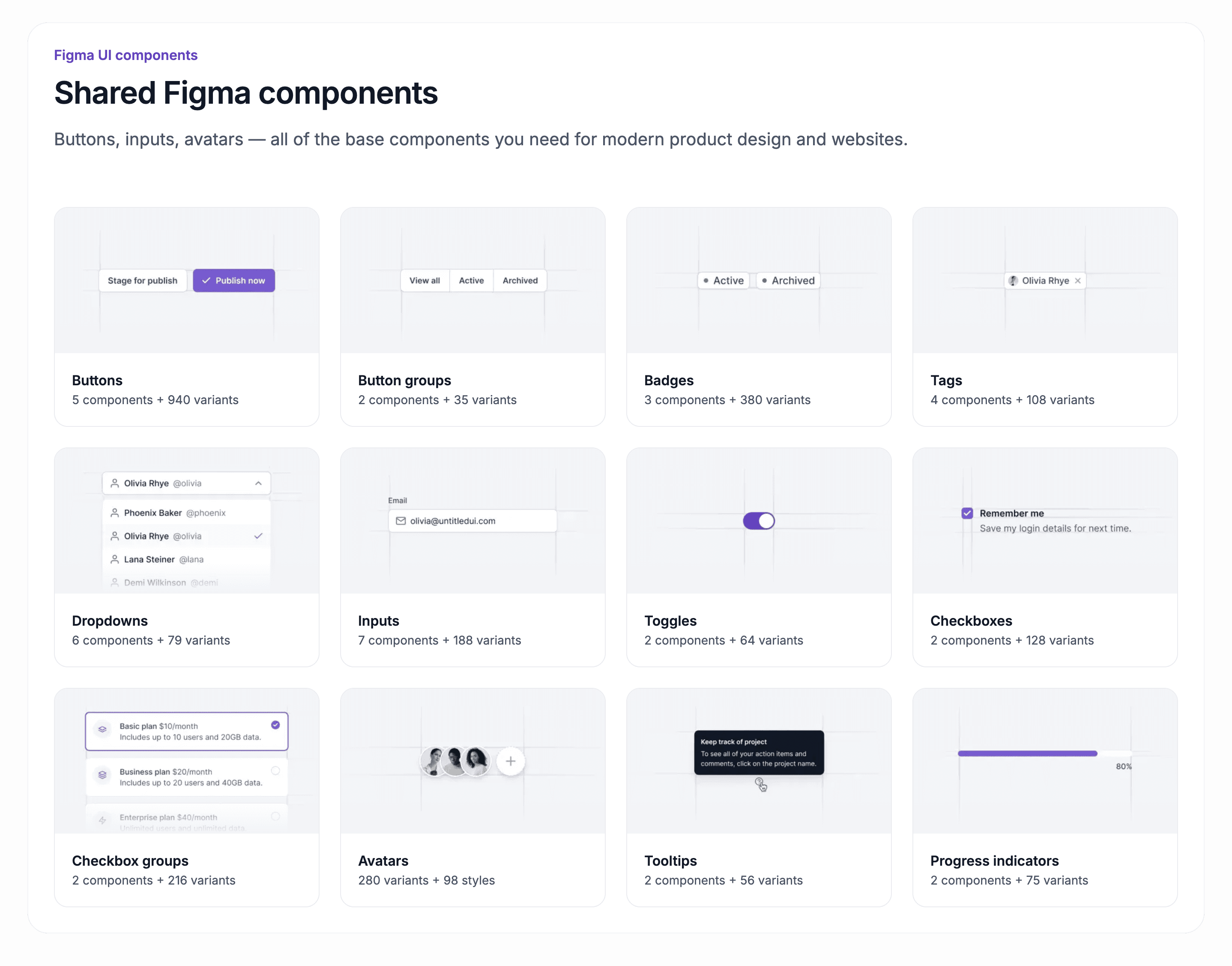
Enters a pre-made Figma library called Untitled UI, that would provide us with an extremely well-made base for our Ui Kit. It truly took out the tedious work out of building a Ui Kit, while allowing us to focus on what really mattered : Ux patterns, a polished, meaningful navigation system, page templates, colors, typography, etc.
Foundations
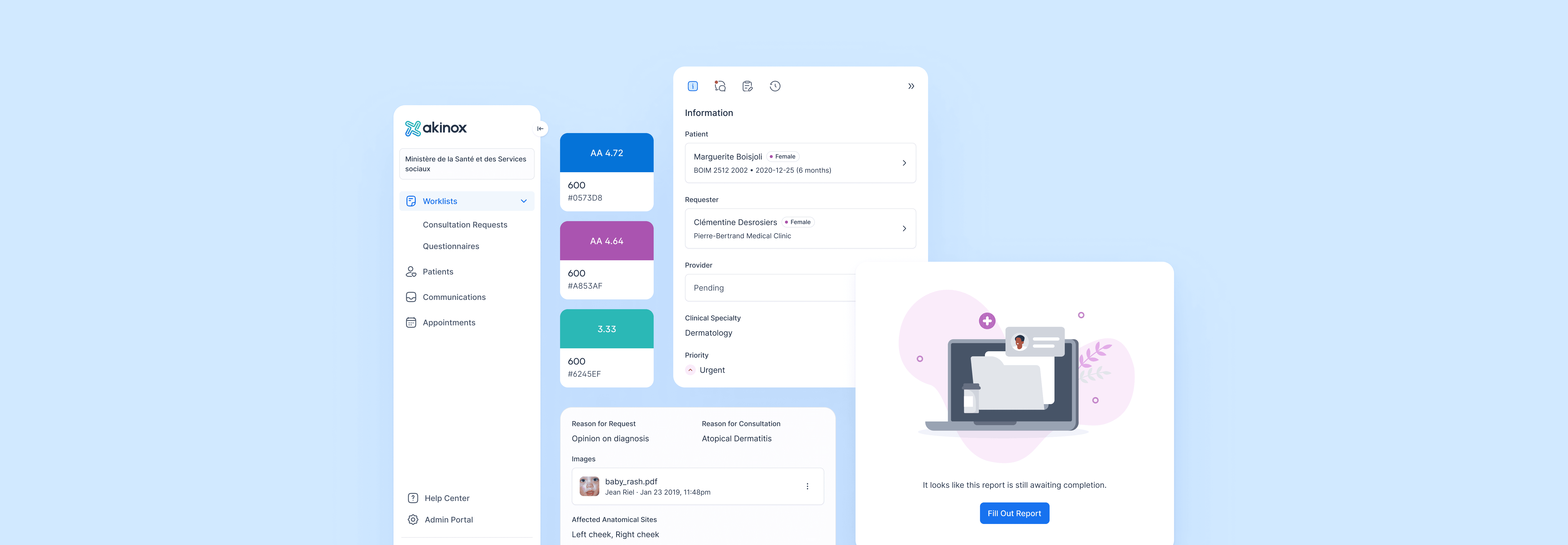
We started our style guide with colors and typography. Coincidentally, our in-house graphic designer had just completed a makeover of the Akinox brand, with a new logo, typography, illustration style, color palette, etc. Her work was geared more towards printed material though, so I worked with her on establishing guidelines for our apps that wouldn't clash, but that were more appropriate for interface design, especially in terms of accessible contrasts. We adapted her illustration style for empty states and log in pages and selected a simple style of icons. And finally, we adopted Maison Neue as our official in-app typography,
Components
All of us designers would pick and choose a component to work on, depending on what would best fit the feature they were currently working on and according to the priority list we had made.
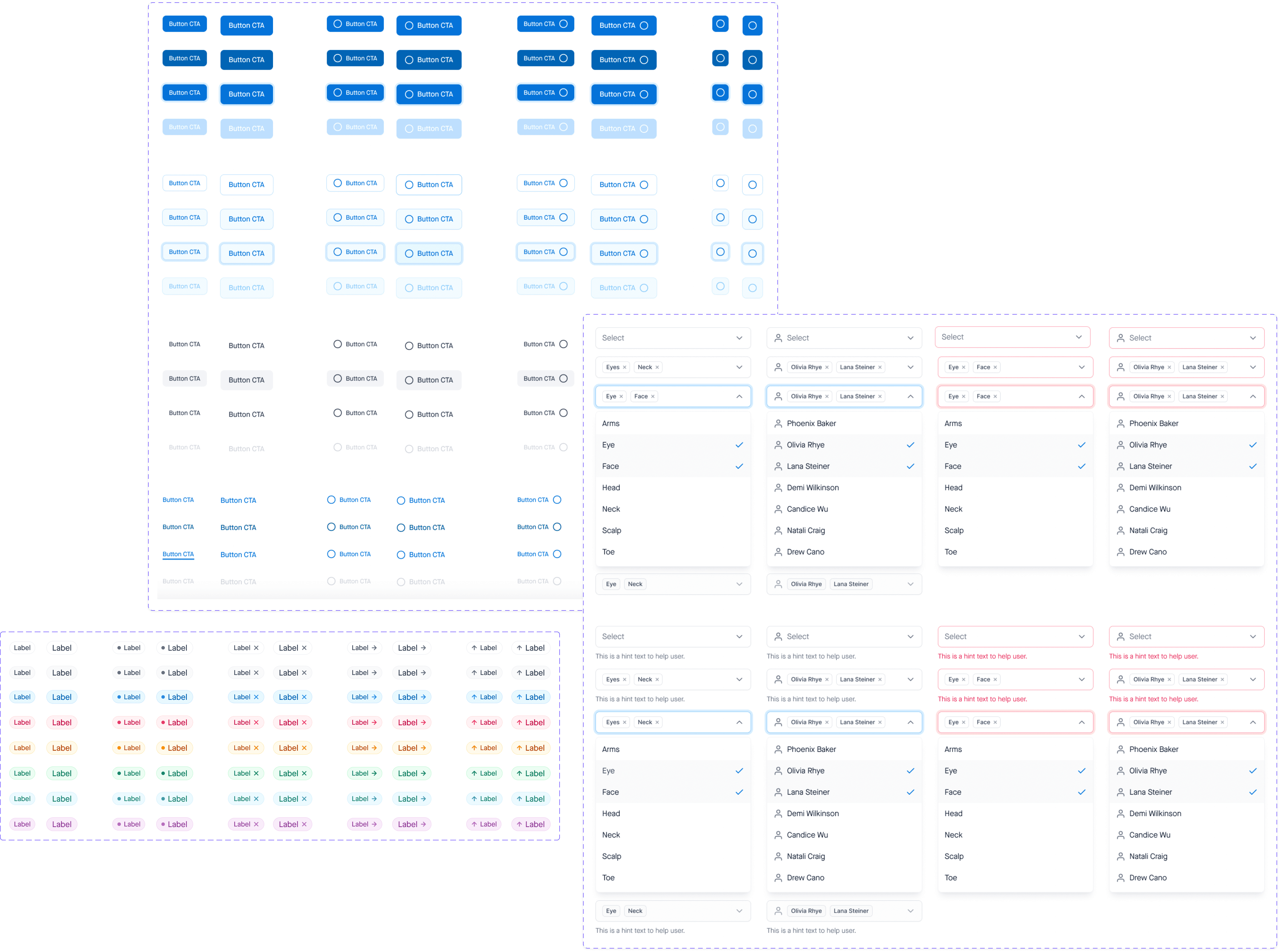
While refining the main components, we tried to think of all the possible scenarios for each of them. We wanted them to be easy to use, so that we would very rarely have to detach instances in our projects (and ideally, never).
I personally worked on buttons, pills, table headers, input fields, dropdowns, the file upload module and progress steps.
Molecules
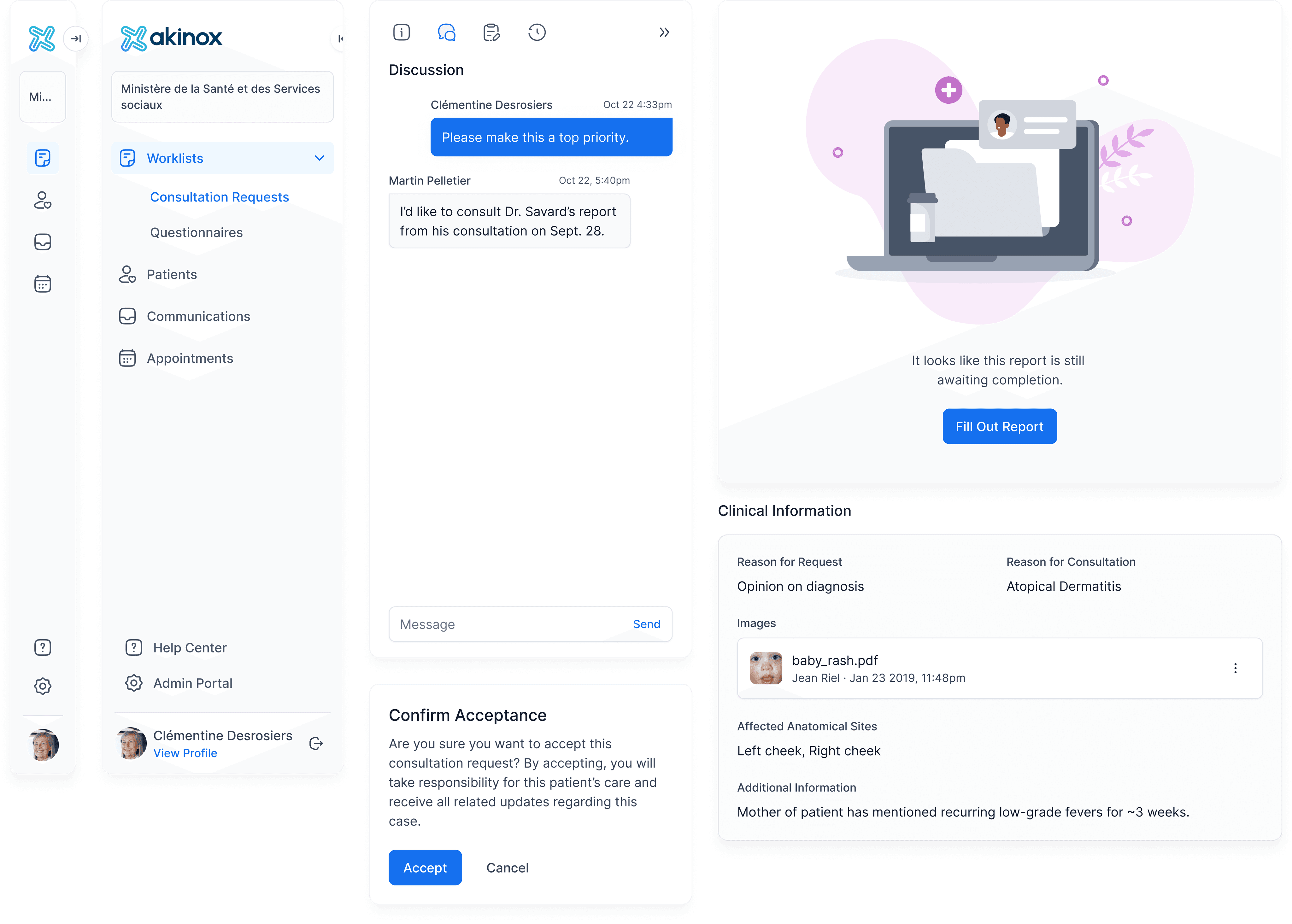
With the molecules began the real fun part. This is were everything came together, and we could take a step back and appreciate the overall fluidity of our brand new Design System - which was incidentally named Magie Magie!
I handled empty states, modals and dialogs, and mostly the new navigation bar for both clinical and admin sections. Since this was a major change, we truly needed to do some user testing. We didn't have the time or resources to perform formal usability testing with real users - physicians - but we did gather a few colleagues that weren't familiar at all with the apps - HR & Finance folks - and went through a few tasks with them. This allowed us to at least confirm whether our information architecture made sense.
Documentation
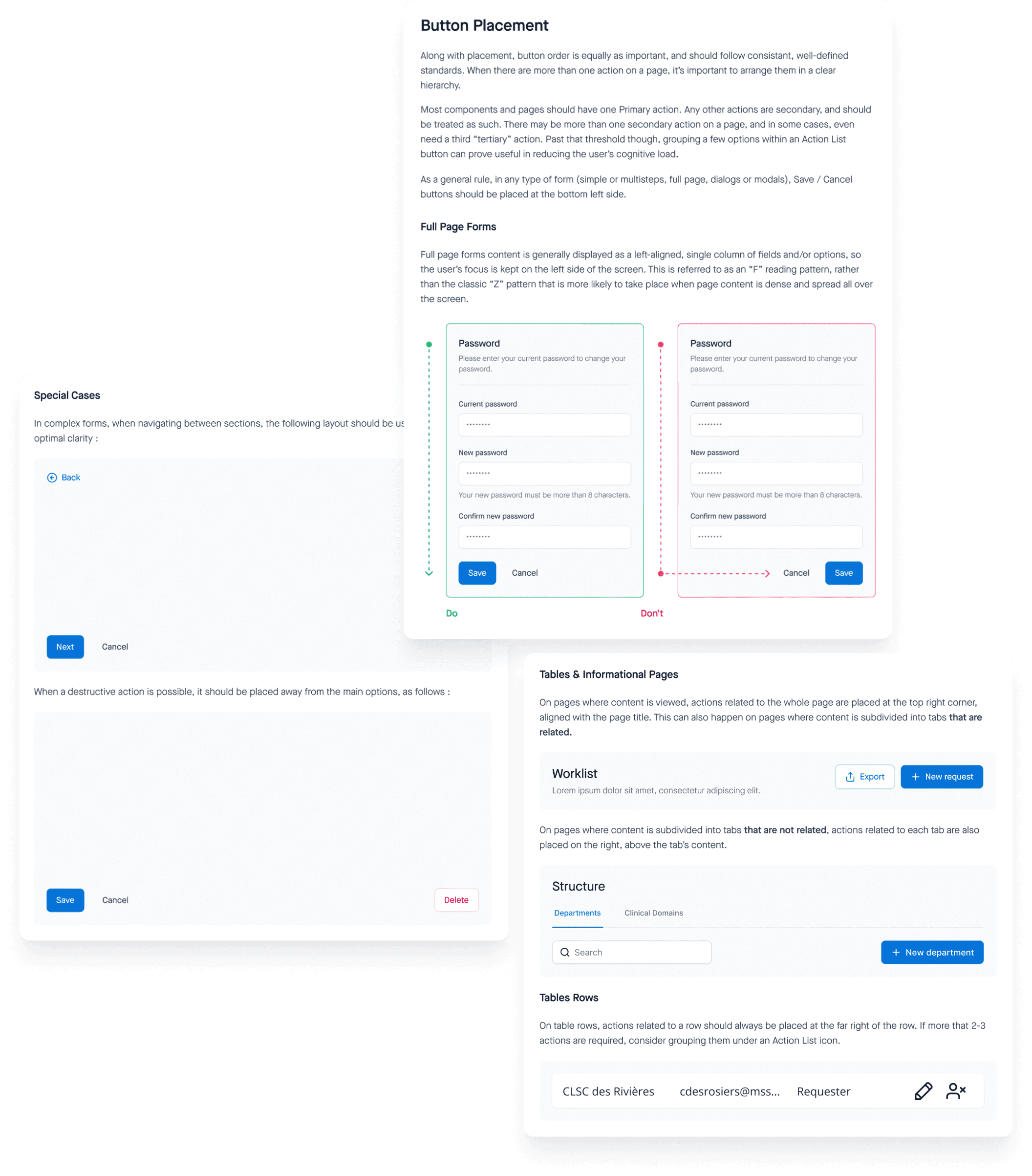
That was the tricky part, and to be completely honest, the one we kept pushing back. I worked on a template so that at least the content would follow a certain standard across our documentation, but for now it's filled out as drafts at best - with the exception of buttons, that I set as an example.
We are also still trying to figure out the best way to present it : right now it's all in Figma, but we are looking at Confluence and Storybook to hold all guidelines on how to actually use the library, for developers and designers.
Pages
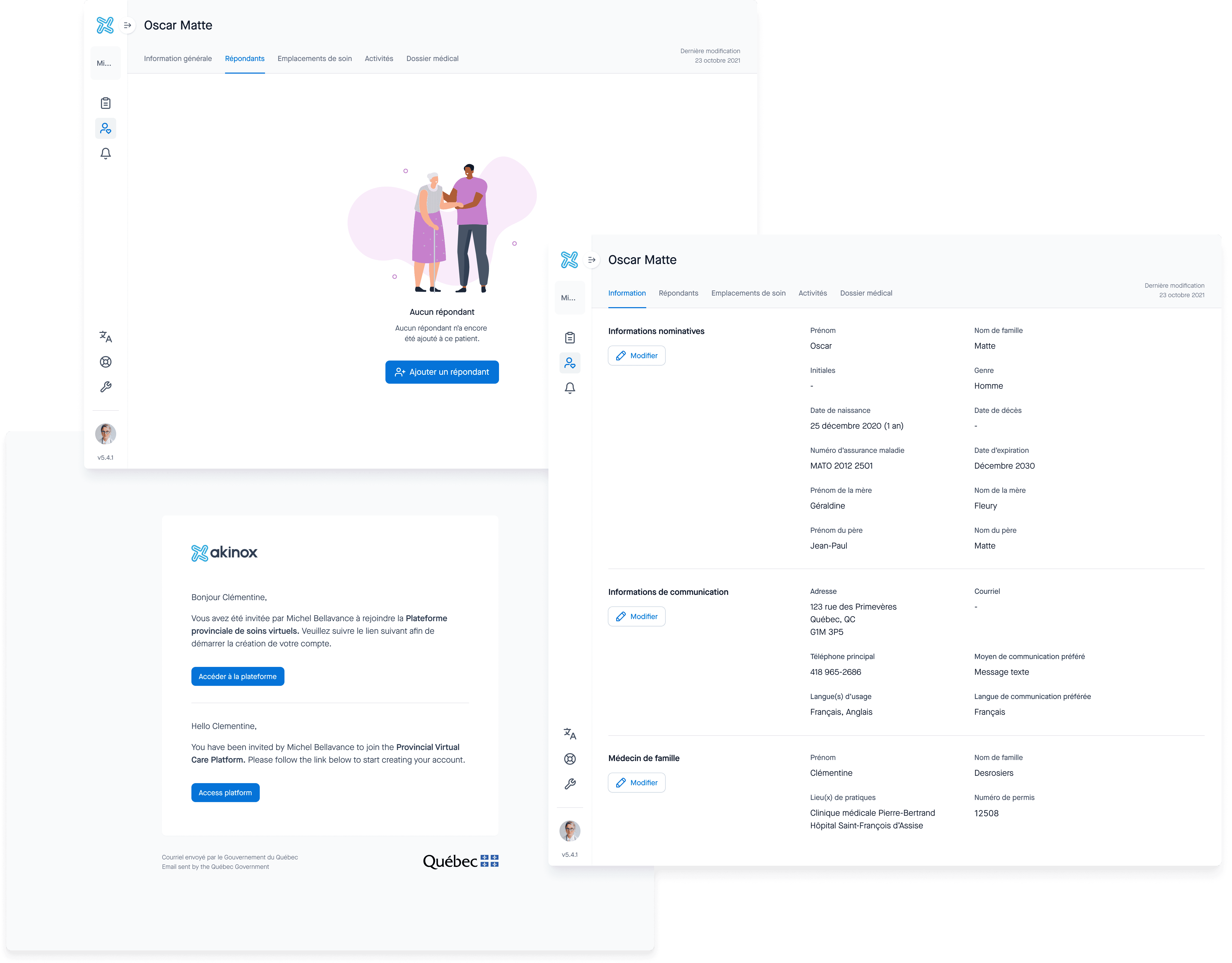
We started out with converting the easiest pages : forms. As a first step, we kept pretty much everything in place, we didn't rearrange elements into steps or anything of the sort. It allowed us to integrate new input fields, buttons, pills, checkboxes, radio buttons and a few new icons.
I also worked on a standard for layout, as forms were sometimes presented as full pages, and other times as overlays - seemingly without a logical reason behind it. So I worked with developers on converting all complex forms to full pages. For instance, user creation - on the right - was formerly presented as an overlay over the users list, which made things complicated since secondary forms - such as department creation - could come over it.
Log In
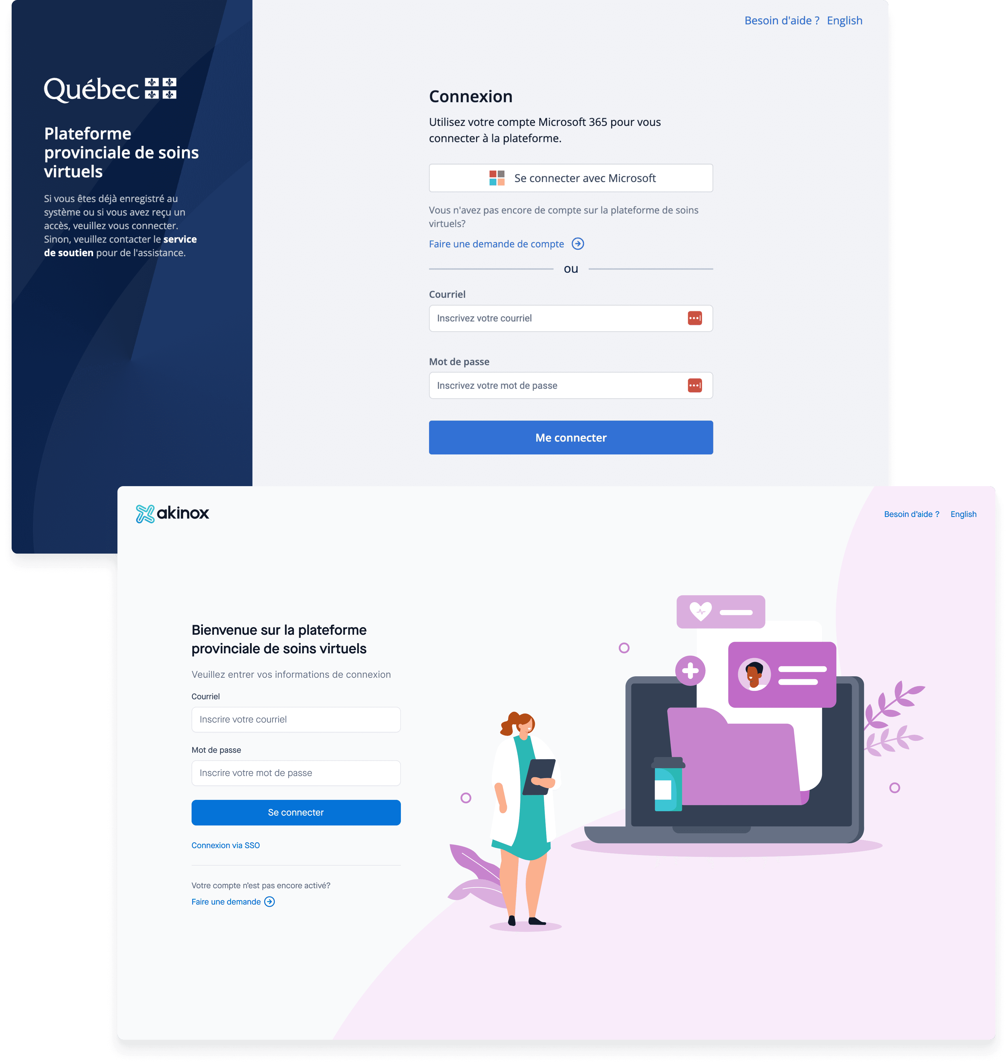
I had the chance to work with our clinical committee on this. Antoinette, the clinician in charge, actually mentioned that "our current login page [was] very ugly". It was quite a bold statement, but she was quite right 🤷♀️ so I dug deeper into what was really bothering her.
I then found out that it was really important that our login page felt highly polished, clean and inviting, so that physicians felt inclined to register to yet another tool that could potentially add to their overloaded schedule - especially since government-provided tools were often ancient and hard to use.
Testing
The real challenge was for the developers : this was quite a drastic change code-wise. We also had to evaluate the performance of our new patterns with the backend team : they had a few recommandations for us, in terms of loading and lists. We're also getting the QA team on board with cross-browser and cross-device testing.
As with testing with users, since we had done very little Ux-wise, we decided to wait until each of us designers worked on features with our new system, to make it part of our usability testing routine.
Results & Takeaways
I always believed that a strong design system is the mother of all tools for polished, effective, consistent product design, and this is definitely in the lines of what we had set as our goals. We did run into a few challenges, though :
Some designers had a very hard time learning and adjusting to Figma. It made the creation of component especially challenging for them, so we spent a lot of time reviewing each other's work.
There is a lot of documentation missing on how to actually use the system, so growing the team of designers or developers would have been a challenge.
But it was very much alive, and bound to keep evolving as the product grows, we just had to make sure it didn't become an afterthought.
