Request Dashboard
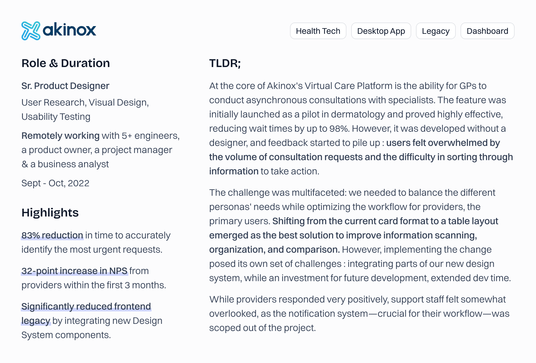
Streamlining the dispatch and prioritization of consultation requests to reduce the workload for physicians and their support staff.
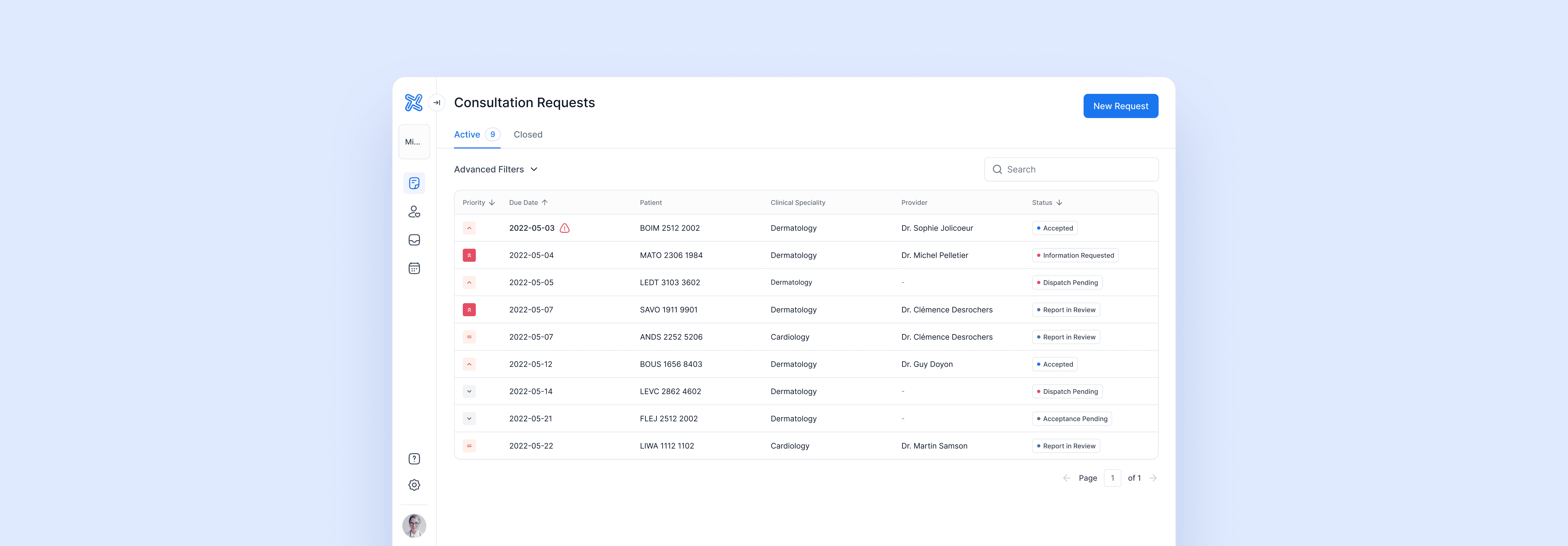
Final Solution
Problem
As I joined the team, we began receiving feedback, mostly from dispatchers, secretaries, and providers, indicating that they were facing a high volume of entries and feeling increasingly overwhelmed by the complexity of sorting through the information to take action.
Objectives
With the help of a BA and our clinical committee, review the data and format of the consultation request dashboard from the perspective of our main personas.
Identify the key triggers for efficient dispatch, prioritization, and acceptance, and concentrate on providing maximum affordance for those elements.
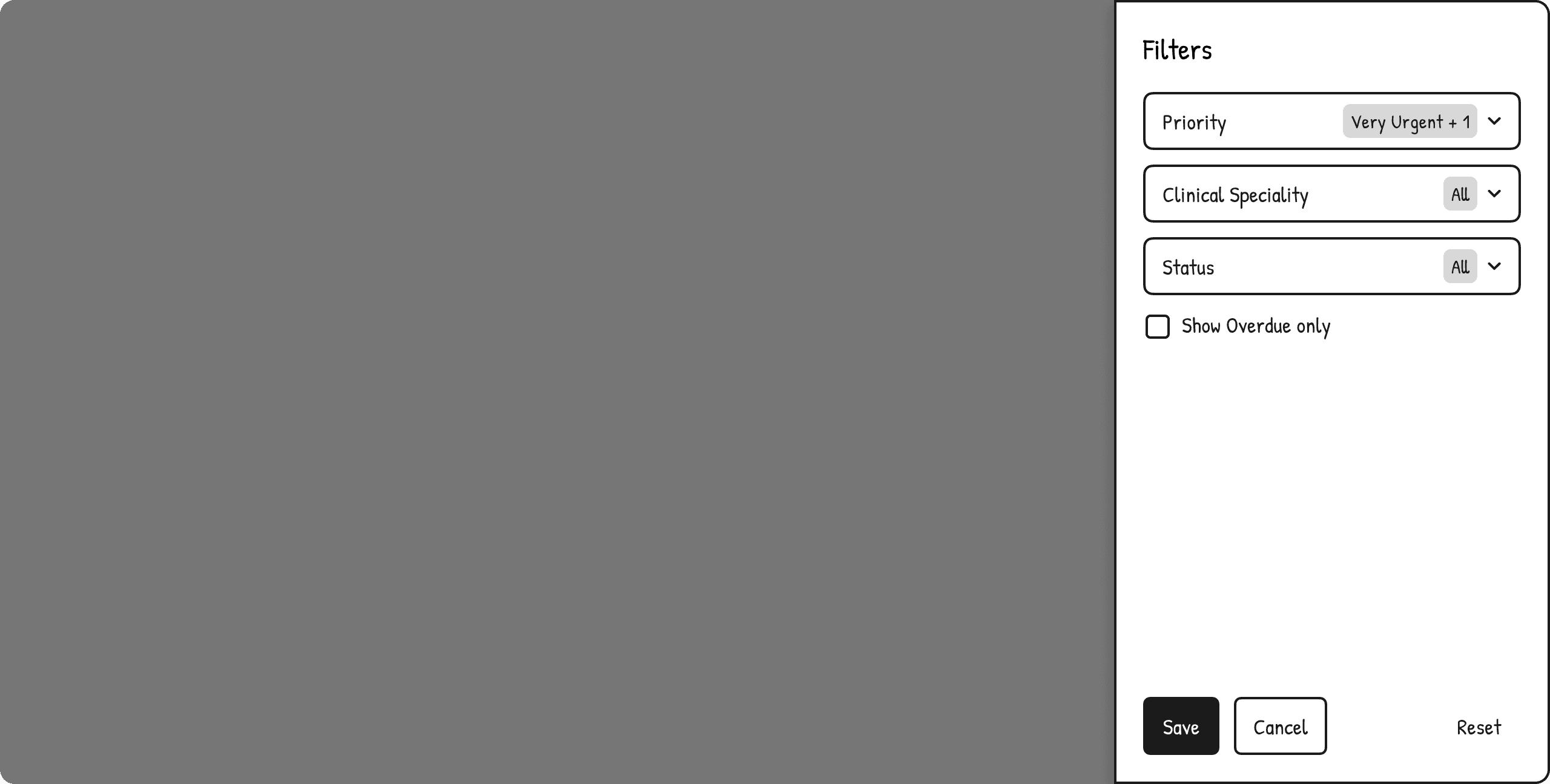
Provide better filtering and sorting options to accommodate a wide range of use cases.
Interviews & Personas
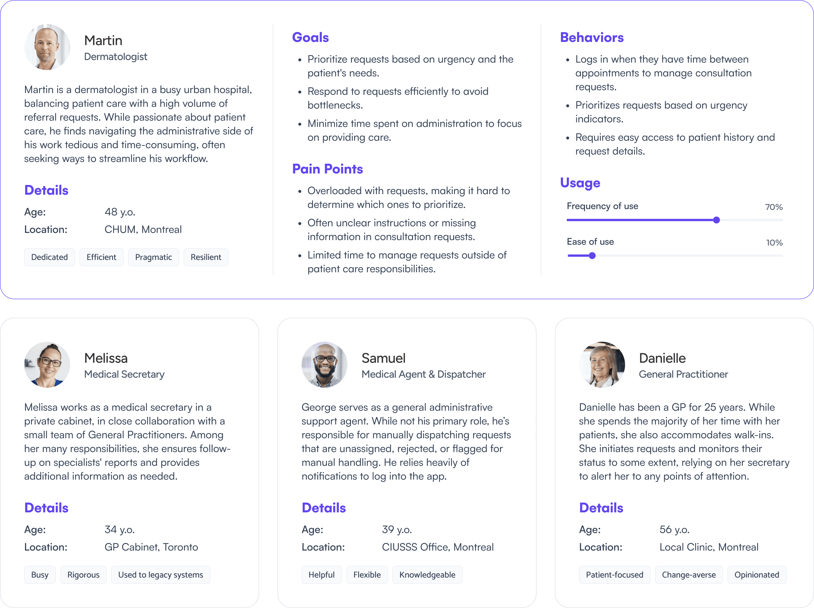
I initiated this project by conducting a workshop with Leila, our BA, and several members of our clinical committee to gain deeper insights into their realities and needs. Through this process, I gained a better understanding of our different personas, each with distinct behaviors and requirements, which made prioritization a challenge. After careful consideration, we chose to focus mostly on providers, as the whole workflow is primarily destined to them.
Heuristic Analysis
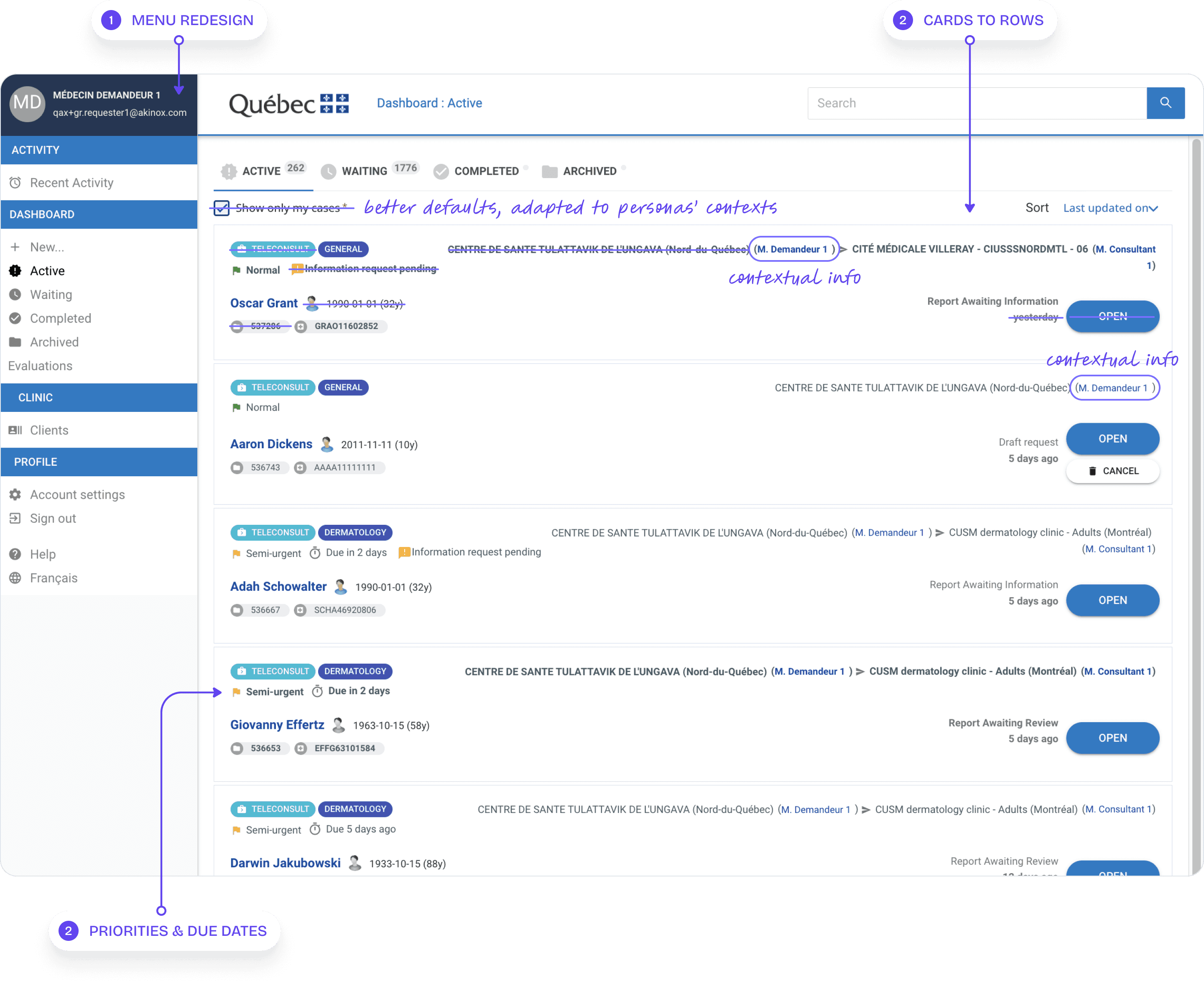
Menu Redesign : the main navigation was cluttered by duplicated information. In the parallel initiative for the design system, I conducted a complete refresh of the user menu. The main goal was to establish separate worklists for questionnaires and consultation requests, as they consist of entirely different components. I also made the menu collapsible to save space and to accommodate upcoming features.
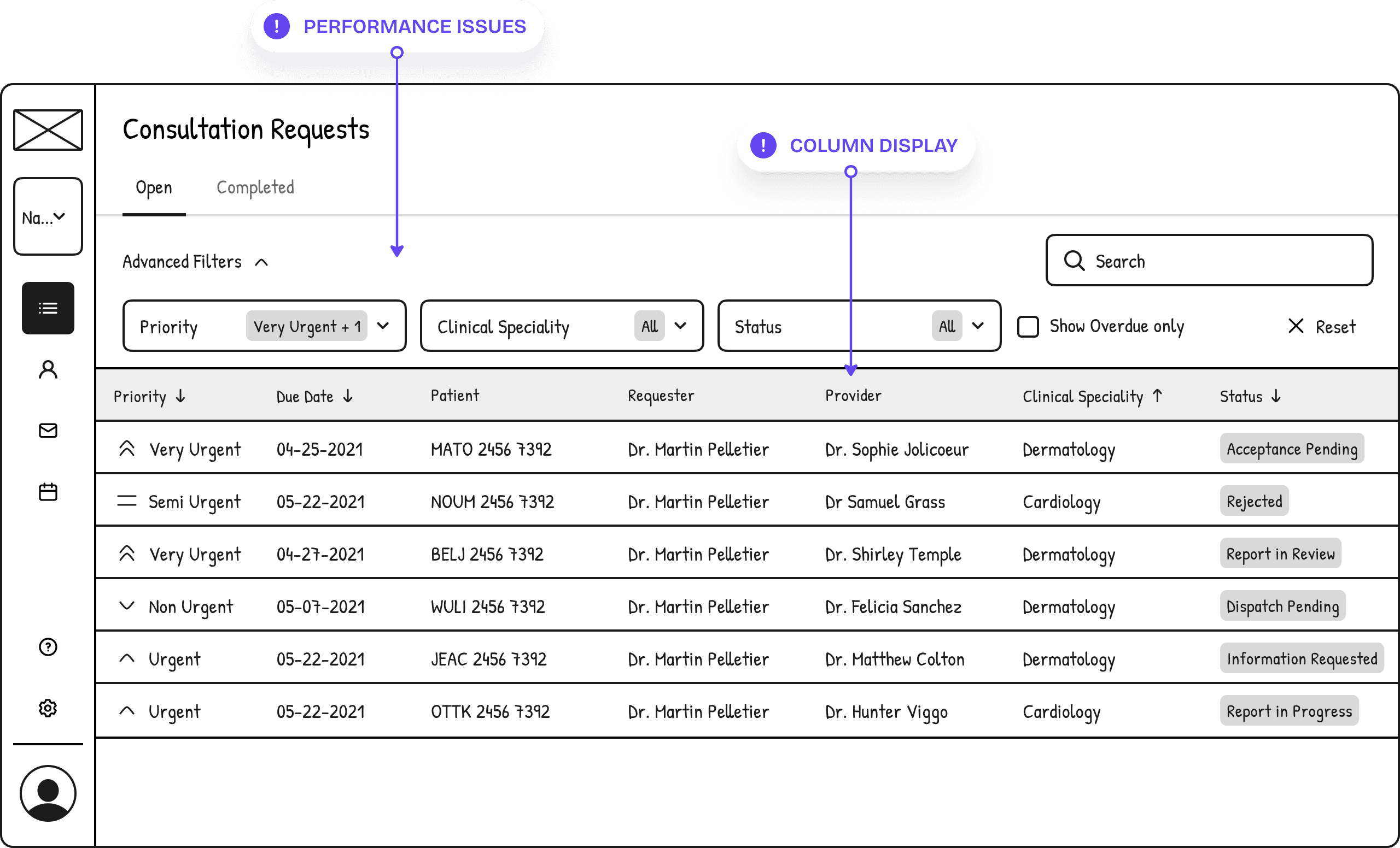
Card Format : all users agreed that the list was extremely difficult to interpret and act upon in its current form. Transitioning to a table was an obvious choice due to the density of information, but we still needed to prioritize certain items and remove others. To address this, we held two workshops with the clinical committee to discuss the issues and reach a final consensus.
Priorities & Due Dates : users identified these elements as the most crucial pieces of information for driving effective decision-making, so I had to make sure that they were easy to spot and interpret.
Challenge - Display, Filters and Sorting
We began with a straightforward implementation of filters, but some users found it cumbersome that the filters concealed content, requiring them to trigger the filter rather than allowing the list to adjust automatically. Our backend engineers expressed hesitation about implementing live changes due to concerns regarding performance and load times.
Adjusting column visibility based on persona and edit/viewing rights proved challenging; for example, providers did not need to see the "Provider" column since their dashboard displayed only accepted requests. Our objective was to minimize clutter and focus on the most relevant information.
Determining the default sorting for columns also posed a challenge, with varying opinions on whether to prioritize highest priority or closest due date first. Input from the development team suggested implementing persistent filters to save individual preferences between sessions, which simplified the decision-making process.
Challenge - Statuses
The numerous statuses also presented a significant challenge, especially in attributing color codes that were both meaningful and not overly bright or overwhelming. We aimed to strike a balance that would enhance usability without causing visual fatigue. Additionally, we found that the existing copywriting was confusing for some users, so we focused on simplifying the language and making it clearer.
Usability Testing
We received regular feedback from our close collaboration with the clinical committee, which alleviated the need for formal usability testing. Along the way, we still conducted several experiments, asking users to locate specific information while noting their speed and accuracy—key metrics for this project. These experiments revealed significant improvements in both areas, validating our design decisions.
Takeaways
This project was multifaceted and at times quite challenging. Balancing the needs of our different personas proved tricky, and there were moments when it felt like we might never reach a solution that satisfied everyone. However, by focusing on the needs of our providers, we were able to make informed decisions when we felt we were veering off course.
The project ultimately took more development time than anticipated, which delayed the refactor of the consultation request itself, the next phase of our work. This may have impacted our ability to deliver an exceptional end-to-end experience, but we made the most of what was within our control.
