Consultation Request
Optimizing communication between healthcare providers to speed up access to specialized care.
Final Design
Problem
Physicians are already dealing with numerous outdated and inefficient systems. The pilot was conducted without a designer, resulting in an interface that appeared just as cluttered and outdated as the ones they were accustomed to. It's was no surprise that they were reluctant to adopt it.
Objectives
With the help of a BA and our clinical committee, review user flows from the perspective of our main personas.
Conduct a heuristic analysis of the consultation request with a special attention on structure, navigation and information architecture.
Start implementing front-end components from our brand new Design System to make it look modern and polished.
Getting Started - Flow Analysis
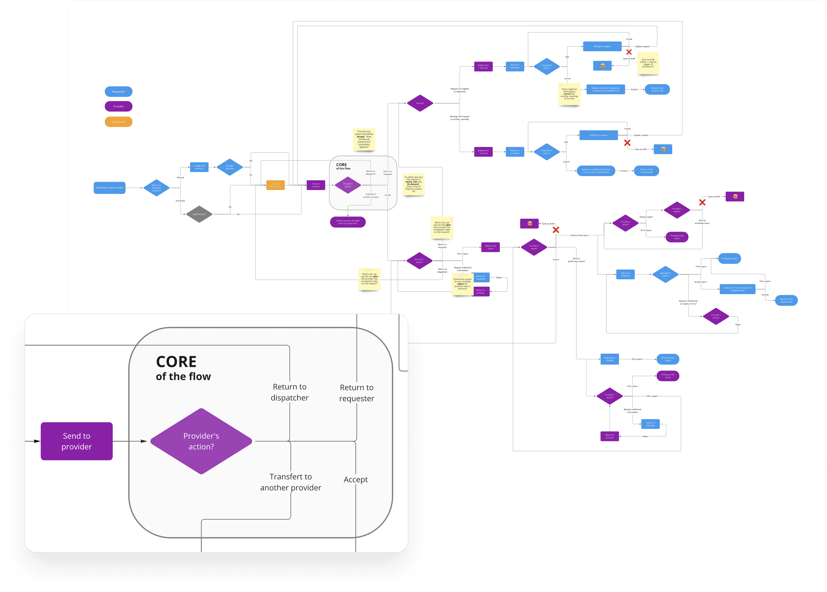
Most of the analysis had been conducted by business analysts prior to my joining Akinox, and it was spread across several Confluence pages, making it difficult to get a comprehensive overview of the flows. The first thing I did was map out the entire flow in Miro, following the current paths within the app. From that point, I compiled a list of observations:
The core point of the flow - when the provider has to take a decision - was cluttered with options and no clear primary action.
Some steps felt unnecessary and hindered the swift resolution of requests, while certain options lacked clarity in relation to the context and prior actions.
The Save as Draft buttons merely served to manually trigger the autosave feature (?). Additionally, user feedback indicated that the lengthy toast notifications for autosave felt intrusive and distracting.
Some labels seemed a bit confusing.
Information Architecture
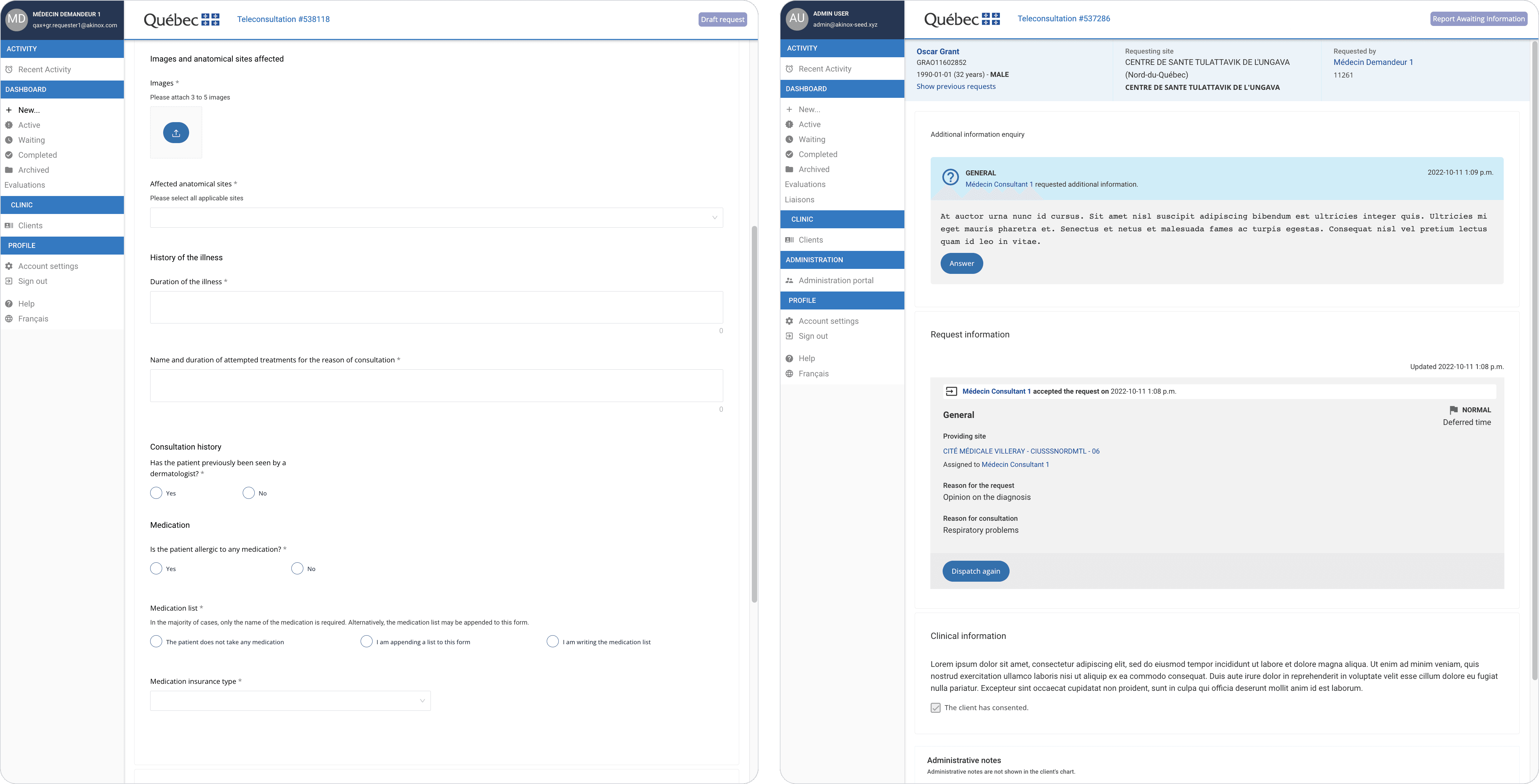
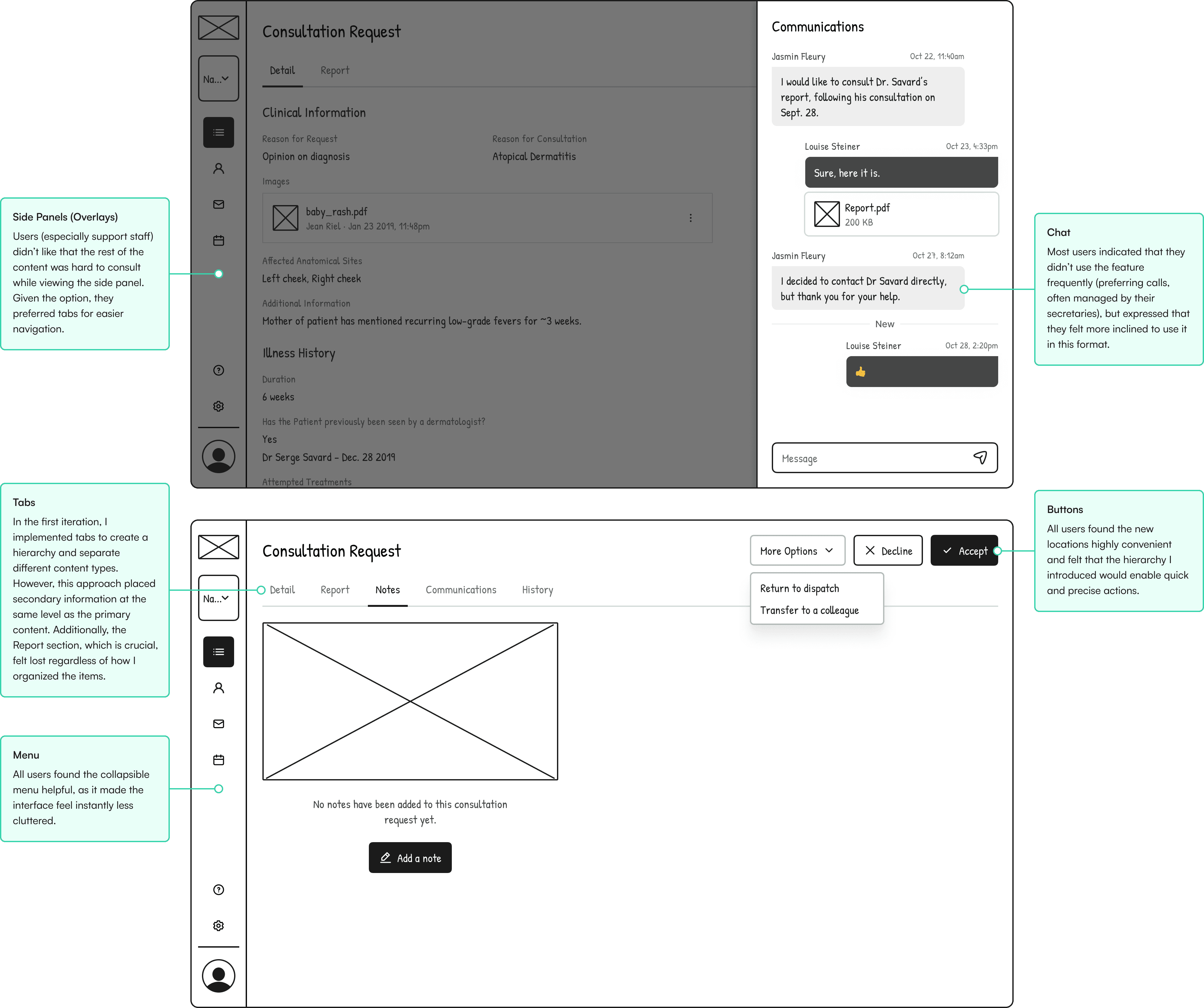
The request was overloaded with information, all crammed onto a single screen—no tabs, drawers, or side panels for organization. To inform architectural decisions, I needed to evaluate:
What information is absolutely critical for the requester to complete in order to send the request to the appropriate provider? Is this done while still engaging with the patient?
What non-clinical information does the provider need to make an informed decision?
Who needs to access secondary information, such as admin notes and request history, and for what purposes?
Interviews
To address these questions, I collaborated with Emilie, the Product Owner, to design and conduct two interview sessions with our clinical committee. There were some limitations: the absence of a specialist in the group allowed for some speculation, but we gathered meaningful insights :
In addition to GPs and specialists, secretaries, dispatchers, and admins would also access and potentially interact with the requests, but they had entirely different—albeit secondary—purposes. Each of these roles required their own tailored version of the interface.
With everything on the same level, and no clear indications of required fields, it was difficult for GPs to draft out the requests efficiently, especially since in a lot of instances, they would do so while still in presence of their patients.
According to GPs, the information needed for providers to make decisions was much simpler than what was currently displayed. Aside from clinical details, all they required was a list of prior consultations in their specialty, which they already had access to through another adequate system.
Exploration
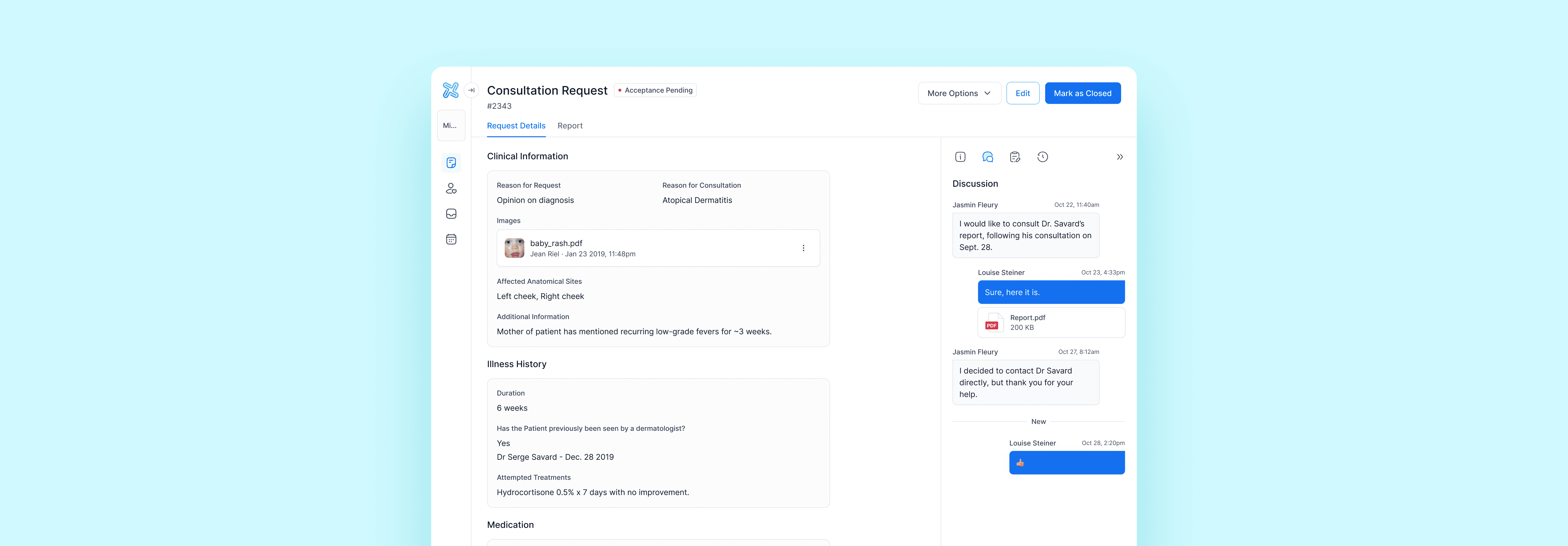
Regarding the request itself, I focused on separating sections and placing the clinical information of the request and report front and center. I then worked on the best way to display secondary information, such as conversations, notes, and admin details.
Usability Testing
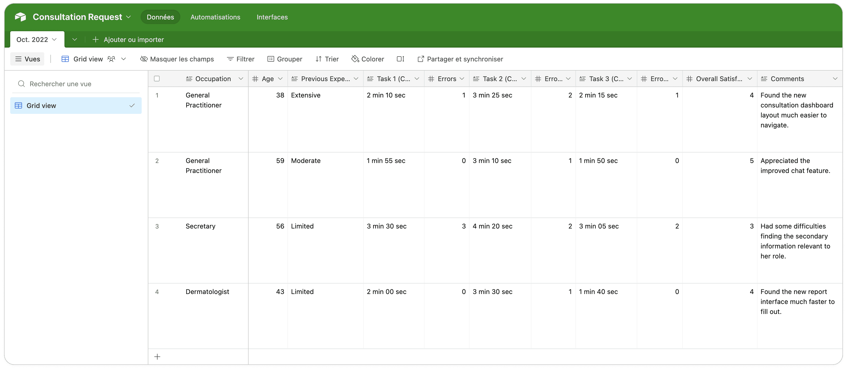
We were running short on time and feeling pressure from the project managers to wrap up, so we agreed that the development team could start working on the general layout and some missing UI components. Meanwhile, I would conduct final usability testing sessions with members of the clinical committee we hadn’t yet consulted. I asked them to perform three basic tasks:
Task 1 : on the consultation dashboard, find 3 requests that needed immediate attention from any actor (GP, specialist or administrative personnel), then order them from the most to least urgent.
Task 2 : from the GP perspective, fill out a new request for an urgent consultation with only mandatory information.
Task 3 : from the Dermatologist perspective, find out about a prior in-person consultation with a dermatologist.
Since we didn't conduct usability testing on the original interface, it was hard to pinpoint exactly what areas had significantly improved, but overall, task completion was satisfactory, and the reception was really positive.
💣 Unfortunately, that's pretty much where this project stopped : it was put on the back burner, at the client's request. This was one of the challenging aspects of trying to develop a product within contractual boundaries.
Takeaways
This project was very close to my heart, so facing a setback so close to the finish line was tough for both the team and the clinical committee, who were excited about the upcoming changes. As we prepared to roll out the pilot to new specialties, I continued to advocate for the improvements we had suggested and proposed various ways to implement smaller updates incrementally.
On the bright side, this work had a positive impact on our design team, as it allowed us to test our brand-new design system within actual page templates. This process highlighted a few key areas for improvement, leading us to rework several components.
Additionally, one of my colleagues leveraged my work on the side panel to begin designing the appointment module, another part of the ecosystem mentioned earlier, which fortunately remained a priority.
